Matplotlib for Python Developers : Summary
For any number crunching work, be it making a report or developing a model or doing data diagnostics, visualization of the data is imperative. Be it univariate or multivariate data, visuals help us to look beyond the summary statistics or test statistics. For someone working in finance, there is an entire discipline of `Technical Trading' where buy , sell , stop-loss decisions are made based on visuals. Whether one believes it or not is a different question altogether. Keeping Technical analysis side, there is an obvious need to look at data, be it histograms, density plots, contour plots, barplots, boxplots, etc. Tools that churn out these graphics are compulsory in any data analyst’s toolbox. My toolbox contains ggplot2, lattice and base-R. I had started using ggplot2 package, 4 years ago, and since then I have been using it regularly in my work. Since the output is usually publication ready, one of the real life situations where I had used ggplot2 visuals was in an annual newsletter to investors that reported their portfolio performance. I don’t think anybody cared about what the visuals were saying as long as the portfolio was making money. But using ggplot2 definitely lent a professional look to the newsletter.
Well the quality of output was certainly one of the motivations behind learning and using ggplot2. However there was a bigger reason that I got attracted towards ggplot2. ggplot2 is not merely something that is helpful in drawing some visuals. It is much more than that. It has an underlying grammar based on Wilkinson’s Grammar of Graphics. Once you take an effort to understand the layered model, you look at a graph from a completely different viewpoint. When I encountered ggplot2, I was totally thrilled because it taught me how to map data to a visual. I can safely say that the grammar model gave me new eyes to look at a visual. Before using ggplot2, I really had a very cursory understanding of statistical graphics. Anyways, I will try to write a separate post on ggplot2 at a later date.
This post is about Matplotlib. I have started liking Python for data analysis. However I have realized that my toolkit was empty for doing visualization in Python. Any book that I start reading on data munging , data cleaning using Python modules, I could not move past a few chapters as there was always a reference to Matplotlib. There was no other option but to slog through Matplotlib and understand the details. I am coming to Matplotlib after working with ggplot2. So learning Matplotlib was an interesting experience where I constantly asked questions like, “How does ggplot2 do the samething ?” “Is the graphing capability for this particular problem better supported in Matplotlib or ggplot2” etc. This kind of constant comparison with ggplot2 and base-R packages helped me understand Matplotlib better.
In this post, I will try to summarize only 50 percent of the book and there’s a reason for it. The first 4 chapter and the last chapter are most relevant for an analyst doing interactive data analysis. There are four other chapters dedicated to embedding Matplotlib in GUI libraries like GTK+ , Qt 4, wxWidgets and the web interfaces. These are more specialized tasks that I don’t think I will be doing in the near future. For a number cruncher like me, the ability to quickly map data to visuals in an interactive manner is the key to doing a good job. Keeping that requirement in mind, I have read only five chapters from this book and have ignored four chapters that deal with embedding Matplotlib. So, in a sense, this summary is a partial summary of the book. Let me try to summarize these five chapters:
Introduction to Matplotlib
Firstly, what’s Matplotlib ? It is a python package for 2D plotting that generates production-quality graphs. It supports interactive and non-interactive plotting, and can save images in several outputs. It can use multiple window toolkits and provides a wide variety of plot types. But the biggest USP in my opinion is the ease of use. Who’s the lead developer for Matplotlib? It is written and maintained primarily by John Hunter.

John Hunter started off Matplotlib as a result of patch rejection from iPython. It was modeled on MATLAB because graphing was something that MATLAB did very well. The high degree of compatibility between them made many people move from MATLAB to Matplotlib. The current version that is available for download is Matplotlib1.1.0. To get an idea in to the massive effort that has gone in to this library, have a look at some of the statistics of Matplotlib 0.8480 that were made in presentation by John Hunter.
There are
-
80 python modules
-
21 files of extension
-
110,000 lines of code
-
189 examples
-
2-5 active developers at any time
-
25 contributors
-
5000 downloads/month
-
500 mailing list subscribers
-
18 backends
These numbers are as of 2006. You might have to extrapolate this data 6 years to get an idea of the massive open source visualization package is out there NOW. No wonder it is used in almost all scientific disciplines.
The book starts off by mentioning the key advantages of Matplotlib
-
It uses Python.
-
Its open source
-
Its a real programming language
-
It is very customizable and extensible
-
It has LaTeX support
-
Its cross platform and portable
Matplotlib gives output in both forms, raster images and vector images. There are two types of backends, Hardcopy backends (output is raster /vector images) and user interface backends. A backend that displays the image on screen is called a user interface backend. Matplotlib introduces two layers , renderer, that does the drawing and canvas , the destination of the drawing. The standard renderer is the Anti-Grain Geometry (AGG) library, a high performance rendering engine which is able to create images of publication level quality, with anti-aliasing, and subpixel accuracy. AGG is responsible for the beautiful appearance of Matplotlib graphs. The canvas is provided with the GUI libraries, and any of them can use the AGG rendering, along with the support for other rendering engines. So to get going, one needs to install NumPy, the Python bindings for the UI you are going to work with, python-dateutil module, pytz - the timezone module. One doesn’t have to worry about all these dependencies if iPython is being used. iPython already has a Matplotlib mode in it. For most of the research purposes, I guess iPython pylab mode is enough to get going. The chapter ends with brief instructions on installing Matplotlib on various platforms.
Getting Started with Matplotlib
This section takes the reader through simple line plots. Through “This-is-the-code-and-this-is-the-output” kind of instruction, the chapter takes the reader through a series of steps , by the end of which, he/she is equipped to draw line plots in python, change the axis labels, reset the axis ranges, add title and legend to the graph and save the plots. The advantage of working with iPython is that whatever changes you make to the figure, they appear instantly on the figure ( sometimes by invoking draw() function). This is a massive advantage because most GUI libraries need to control the main loop of execution of Python, thus preventing any further interaction, i.e you can’t type while viewing the image. The only GUI that plays nice with Python’s shell is Tkinter. iPython in pylab mode starts two threads, one to execute the GUI library code and another thread to handle user command input and hence is so much more useful for a newbie. In fact I found iPython to be tremendously useful while learning NumPy and other packages as it gives instantaneous feedback on what you type. The chapter ends with some explanation to change the default Matplotlib settings. Now this is similar to par() settings in R. Till date, except for a few things I have never really changed them in R. Depending on the graph, I tend to change them in the graphing function itself. From that experience in R and extrapolating it to Matplotlib, I don’t think I will ever change the default settings and meddle with the configuration files.
Decorate Graphs with Plot Styles and Types
For any plot, there is an obvious need to customize stuff. In Matplotlib , the syntax for customization is very simple. If you have to change the color, linestyle and marker style, you can basically change it using just one addition string input to the plot function. Handling xaxis ticks and yaxis ticks also has an intuitive syntax.
There is an interesting pic in the chapter that summarizes the various readily available plots available in Matplotlib
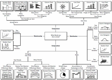
The chapter then goes on to explain the code fragments for generating histograms, pie diagrams,error bar charts, bar charts,scatter plots, polar charts. There is also section on ways to annotate the visual. Overall a very hands on chapter that gives one good enough functions to plot data.
Advanced Matplotlib
This is the really interesting chapter of the book as it explains the OOPS behind Matplotlib. The first three chapters seem almost magical with all plots coming out of Matplotlib blackbox by typing in a few commands. This chapter goes in to the blackbox, explains the OOPS structure in detail. This sort of introduction is invaluable for a newbie Matplotlibber as it equips one with a decent understanding of the various classes and subclasses. This understanding can then be used to go over the documentation of Matplotlib which, by the way, is close to 1100 pages long. Books like these are like the life jackets in the ocean of functions and objects in massive libraries like Matplotlib. I started off with Matplotlib document and it was overwhelming to say the least. This book gave me confidence to go over Matplotlib documentation , not the entire 1100 pages but the most prominent sections of it.
Matplotlib can be used in three ways
-
pyplot : pyplot provides a MATLAB-style, procedural, state-machine interface to the underlying object-oriented library in Matplotlib.Matplotlib.pyplot is stateful because the underlying engine keeps track of the current figure and plotting area information, and plotting functions change that information. No need to use any object references while plotting
-
pylab - a module that merges NumPy and Matplotlib in to one common namespace so that it gives an environment closer to MATLAB
-
OOPS way - This is the most powerful way to write Matplotlib code because it allows for complete control of the result however it is also the most complex. This is the Pythonic way to use Matplotlib, and it’s highly encouraged when programming with Matplotlib rather than working interactively.
The chapter then shows a sample graphic using the first two ways, pyplot and pylab. It subsequently introduces the basic objects in Matplotlib that gives one the control on the plot, i.e , Figure Canvas, Figure and Axes. The flow of objects is as follows : You start off with a figure object, add subplots to it and work with Axes objects. Once you have figure object and axes objects , you can invoke ton of functions and customize the look and feel . You have much more control over the graphic like setting the scale of the axis, sharing axes etc. The chapter has an important section on dates. This is very useful for plotting financial data. By using locators and formatters, the section shows various ways to show a time series graphic with legible date formats on the x axis. Another interesting things about Matplotlib is the use of LaTeX annotation. Matplotlib includes an internal engine to render expression, mathtext. The mathtext module provides style mathematical expressions using FreeType 2 and the default font from , Computer Modern. As Matplotlib ships with everything it needs to make mathtext work, there is no requirement to install a system.
The chapter ends with contour plots. Ideally this should have appeared in chapter 3 along with other plots. Clubbing it with OOPS concepts makes it a little out of place. In any case, the contour plots are highly useful. As an example, lets say you do a singular value decomposition of a matrix. Linear algebra tells us the resulting matrices form an orthogonal basis. Now you can use contour plots to check that. Lets say I simulate a 20 by 20 random matrix, do an svd and get the u and v matrices. If I take a dot product of u and u transpose , get a 2d matrix, plot the 2d matrix as a contour plot, you get the following visual
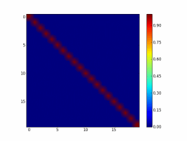
All the 1 are on the diagonal and the rest of matrices are populated with 0 values. This tells us that u forms an orthonormal basis.This kind of visualization of matrices is just one of the many things that one can do using Matplotlib
**
Matplotlib in Real World
**
This is an interesting chapter of the book that gives a half-a-dozen real life case studies where Matplotlib is used as an effective visualization tool.
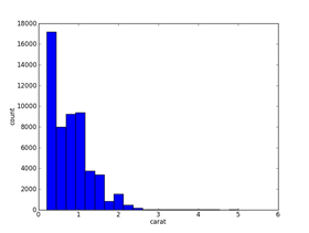
After going through this book on Matplotlib I think I have to work with this library and see where it stands with respect to ggplot2. For univariate data, Matplotlib looks like it has the same power as ggplot2 but what about multivariate data. For example, I have used a sample dataset(diamonds) to plot a histogram of one of the data variables using ggplot2 and Matplotlib
Here are the result of Matplotlib and ggplot2(enables to slice based on a different dimension)
Matplotlib
ggplot2
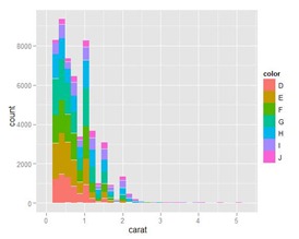
Can one replicate the ggplot2 graphic in Matplotlib ? No idea. Need to figure out whether Matplotlib supports faceting and aesthetic grammar layers like ggplot2. But I guess even if Matplotlib does not support grammer of graphics , I think it is worthwhile to learn it as it becomes an invaluable tool , in doing interactive data analysis in python environment.
 Takeaway
This book is an accessible introduction to Matplotlib that equips a reader enough familiarity so that he/she can go over the mammoth 1100 page documentation of Matplotlib.