Spectral Analysis of Time-Series Data : Summary
I stumbled on to this book way back in September 2010 and had been intending to work on frequency domain aspect of time series since then. I am embarrassed to admit that almost 2 years have passed since then and it was lying in my inventory crying to be picked up. Why did I put off reading this book for so long a time? May be, I am not managing my time properly. In any case, I finally decided to go over this book. In the recent few weeks I have spent some time understanding Fourier Transforms (Continuous and Discrete). I was thrilled to see so many connections between Fourier transform and Statistics. It was like getting a set of new eyes to view many aspects of Statistics from a Fourier Transform angle. Central Limit theorem appears “wonderful” from a convolution standpoint. Density estimation becomes so much more beautiful once you understand the way FFT is used to compute the kernel density, etc. The simple looking density function in any of the statistical software packages has one of the most powerful algorithms behind it, the “Fast Fourier Transformation”. I can go on and on listing many such aha moments. But let me stop and focus on summarizing this book. With Fourier math fresh in my mind, the book turned out to be easy sailing. In this post, I will attempt to summarize the main chapters of the book.
Chapter 1: Research Questions for Time-Series and Spectral Analysis Studies
The chapter starts off by giving the big picture of variance decomposition of a time series. In a time series, one first tries to estimate the variance explained by trend component. From the residuals, one then tries to estimate the variance explained by the cyclical component. Besides trend and cyclicality, there may be other components in the time series that may be culled out by studying the residuals. With this big picture, the chapter then talks about using sinusoid model for cycles. Thanks to Joseph Fourier and a century of mathematicians,physicists, researchers who have worked on Fourier series and transforms, we now know that Fourier series and Transforms can be used to represent not only functions in L2 Space but a much wider scope of functions. The chapter ends with the author saying that her focus of the book is on the cyclical component of the data, a component that some of the econometricians remove before analyzing data. It is common to see that time series analysis examples decompose the time series in to trend, cyclical, seasonal and idiosyncratic components and then work solely with the idiosyncratic component. However this book is geared towards the analysis of the cyclical and seasonal components after removing the trend component in the time series. Thus the first chapter makes the focus of the book precise and thus setting the tone for the things to come.
Chapter 2: Issues in Time-Series Research Design, Data Collection, and Data Entry: Getting Started
The principles that this chapter talks about are relevant to any research design study. For a researcher who is interested in doing spectrum analysis, the following are the three aspects that need to be kept in mind :
-
Length of the time series
-
Choice of sampling frequency and
-
Should the sampling be time based or event based.
Out of these three aspects, choice of sampling frequency is subtle issue. Well, one can always intuitively understand the fact that high frequency waves masquerades as a low frequency wave, but a simulation always helps in understanding things in a better way.
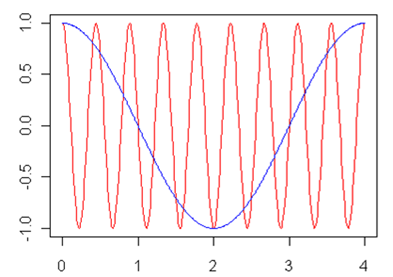
The above visual shows two signals, the red with a higher frequency and the blue with a lower frequency. If one under samples the red signal, it is possible that the analysis throws up the frequency associated with the blue signal. This simple example shows that sampling choice is a critical component for avoiding such errors
Chapter 3: Preliminary Examination of Time-Series Data
This chapter talks about techniques to identify trend stationary in the time series. One important takeaway of this chapter is: If you are planning to do any spectrum analysis on a time series data, it is better to remove trend component. If you do not remove the trend component, the trend produces a broad peak at the low-frequency end of the spectrum and it makes it difficult to detect any other cycles. The author uses airline usage dataset, a widely used dataset in time series literature to illustrate various concepts such as
-
Detrending a time series using differencing
-
Use of OLS for detrending
-
Box-Ljung Q test to check the presence of correlation for a specific number of lags for the detrended data
-
Durbin Waston test to check the autocorrelation of detrended data
-
Levene’s Test of Equality of Variances on detrended data to test stationarity ( the function in car package is deprecated. One can use levene.test from lawstat package)
One of the basic criteria for going ahead with Spectral analysis is the presence of variance in the data. If there is hardly any variance in the data, then trend and spectral component might be a stretch in understanding the data. So, that’s the first attribute in the data that makes a case for variance decomposition using Spectral analysis.
Chapter 4: Harmonic Analysis
This chapter talks about a situation where the data analyst is more or less certain about the periodicity of the signal and wants to estimate the amplitude, phase and mean for the wave. This chapter talks about the procedure to perform Harmonic analysis for detrended data. Harmonic analysis is a fancy name for multiple regression using sine and cosine variables as the independent variables. In Harmonic analysis, since you already know the period for the signal, you can easily set up a regression equation and find out the amplitude, the phase and the mean of the signal. The biggest assumption behind the procedure mentioned is the fact that you know the period of the signal. Sadly, it is almost never the case in analyzing real life data. There are certain issues one needs to handle before doing harmonic analysis; some of them are as follows:
-
Period T is not known apriori. Periodogram or Spectral analysis needs to be done
-
Spectral analysis might show some dominant frequencies and one might have to take a call on the set of frequencies to select for harmonic analysis
-
In the presence of outliers, the spectral analysis can be misinterpreted. Transformations of data is imperative to avoid such errors
-
If the data are not “stationary”, then some characteristics of the time series will be changing over time like mean, variance, period or amplitude. In all such cases, simple harmonic analysis would lead to incorrect estimates.
The takeaway from this chapter is that, Harmonic analysis is useful if you are already aware of the period and you are certain that the series is stationary.
Chapter 5: Periodogram Analysis
Periodogram connotes a visual for some people and model for some people. Both have the same interpretation though. In the case of visual, you plot the frequencies Vs. Intensity/ Mean Square. In the context of a model, the null hypothesis is that the time Series is white noise, meaning the proportion of variance represented by various frequencies is nearly constant (You can use fischer.g.test in R to test for white noise in the spectrum).
The formal model for the periodogram is an extension of the harmonic analysis model. Instead of representing the time series as the sum of one periodic component plus noise, the periodogram model represents the time series as a sum of N/2 periodic components. One can use optimization routine to get the estimates for the of the model.For small N values it works well. But if you use an optimization routine to estimate parameters of a model for large N, you soon realize that the coefficients are very unstable. What is the way out ? One can turn this problem in to Fourier series coefficient estimation. The Fourier series are chosen such that the longest cycle fitted to the time series is equal to the length of the time series. The shortest cycle has a period of two observations. The frequencies in between are equally spaced and they are orthogonal to each others, that is, they account for non overlapping parts of the variance of the time series. FFT turns out to be an efficient way to estimate the parameters of the model.
So, to reiterate: Let’s say you have a time series of length N= 2k+ 1 and you want to fit lets say K frequencies to it, you can write down k equations with sine and cosine terms. Each of these sine and cosine terms will have Ak and Bk as coefficients. You can regress with the data but the coefficients will be very unstable. Hence one needs to use Fourier transform to work these coefficients efficiently
Firstly, before doing any periodogram analysis, you need to remove the trend component. One nice way of explaining the rationale behind removing the trend component is this: Partitioning the variance in the periodogram will have longer cycles or lower frequencies that will account for larger shares of variance in the time series. For example if the cycle is of length 14 time units, then one can ideally fit 7 frequencies 14/1, 14/2, ..14/7. If you do not remove the trend, lower frequencies will spuriously dominate the analysis.
Consider this dataset mentioned in the book. This looks like it has a period of 7 days (units for t are days). If we are going to represent the series by an aggregation of sines and cosines, we need to calculate the amplitudes of the same
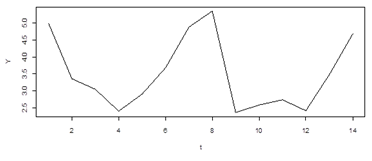
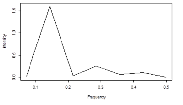
The above visual in the book can easily be reproduced by one line of R code
plot( (1:(N/2) ) / N, ( ( Mod( fft( x ) )^2 / N ) *( 4 / N ) )[2:8] , type = “l”, ylab = “Intensity”, xlab = “Frequency” ) # N=14
This terse line is easy to code but it took some time for me to actually understand the stuff to code it. The x axis is labeled frequencies that start from 1/14 to 7/14. Basically if you are given 14 days points you can fit 7 different types of frequency waves 1/14, 2/14. 3/14, 4/14, 5/14, 6/14, 7/14. Now the above plot is called a periodogram plot. What’s a periodogram plot? Well if you look at the initial dataset, fit a set of sine and cosine waves with each of the above frequencies, you get a pair of coefficients for sine and cosine waves for each of the frequency. Thus there are 7 pairs of coefficients for 7 frequencies. If you find the square those coefficients and add up, you get one value for each frequency. This plot of frequency vs. amplitude square for each of the frequency is called periodogram. Now if there are more number of frequencies to fit, the computation of coefficients for each of the frequencies becomes cumbersome. Thanks to FFT, one can get to periodogram easily. How do you do that? R gives unnormalized Fourier coefficients, sqrt( n) factor is missed out and a factor of exp(2*pi*i*k/N) for each frequency gets added in the fft coefficients. sqrt( n) factor missing was easy for me to understand but the fact that there is an additional factor that was appearing in the FFT coefficients confused me a lot till I understood it properly. In any case since we are interested in the intensity here, all that matter is the correction for square root of n. So, in the one line R code that you see, the division by N is done to adjust that factor that R misses. Now there is an additional 4/n factor that is applied to Intensity from Fourier series. This 4/n is the magic factor that takes the intensity and converts it to periodogram values. Why should one multiply by 4/n? It will take little bit of math to figure it out. Try it out on a rainy day.
FFT algo is obviously one of the finest algos in mathematics. Having no knowledge of DFT, it took me sometime to understand the various aspect of DFT. Someday I will write a post that will summarize my learning’s from DFT. FFT is super powerful algo. Having said that, different packages implement in different ways. Hence it is always better to go over your statistical software manual to understand the output values of the algo. It took me some time for me to understand this stuff in R. Thankfully NumPy also has the same implementation as R for FFT, i.e. the interpretation of the output is same in R and NumPy.
What are the limitations of Periodic analysis?
The major criticism of periodograms is that their ordinates are subject to a great deal of sampling error on variability. Because the number of periodogram ordinates (N/2) increase along with the N of the time series, merely using a larger N does not correct this problem. Spectral analysis refers to the family of statistical techniques used to improve the reliability of the periodogram. Power spectrum is smoother periodogram. What’s the disadvantage of Spectrum analysis? Basically spectrum does not correspond to partitioning the variance.
The takeaways from this chapter are the following
-
Advantages of Periodogram over fitting single frequency
-
How to estimate the frequencies given the data?
-
How to use FFT to quickly estimate the frequencies?
-
How to estimate the regression coefficients of sine and cosine curves from FFT output?
-
How do you scale the intensity values from FFT to get Periodogram values?
Chapter 6: Spectral Analysis
Spectral analysis is a fancy term that means “smoothing” the periodogram. If you have worked on any smoothing procedures in statistics, you will immediately realize the connection here. Basically , you take a periodogram and smooth it. Well if you have studied and worked with density estimation in statistics, most of the methods can be carried over to Spectral analysis. In the case of density estimation, you have frequency counts for various intervals of data and your intention is to create a smoothed density estimate. In the case of spectrum analysis, you have a set of intensities across various frequencies and your objective is to create a smoothed spectrum estimate. What are the advantages ? Well the obvious one is the reduction in sampling error. What do you loose by estimating a continuous spectrum? If it is over smoothed, you might lose the frequencies visible in the periodogram.
How do you smooth the periodogram? There are two things that you need to decide, 1) width of the smoothing window 2) weights that will be applied to the neighboring observations. The combination of width and smoothing gives rise to various types of windows. It is up to the analyst to choose a good way to smooth the periodogram. There is an alternative way to get spectrum estimate. You first calculate the Auto correlation function for M lags. You then do a FFT analysis on this lagged ACF. This method is called Bartlett window. One of the advantages with this method is that you can select the frequencies that you want to use in FFT.
The chapter also discusses confidence intervals around spectrum estimate. The upper and lower bounds of a confidence interval can be computed using a chi-square distribution. In order to set up this confidence interval, it is necessary to determine the equivalent degrees of freedom(edf) for the spectral estimates. I was happy to see this concept of equivalent degrees of freedom coming up in this context. The first time I came across this concept was in relation to local regression. In a normal linear regression framework, degrees of freedom are important. But in the case of local regression, they become mightily important. It is a criterion for selecting a model from competing local regression models. Anyways coming back to this book…. Prior to smoothing, each periodogram intensity estimate has 2 degrees of freedom; after smoothing, the estimated new edf will vary depending upon the width and shape of the smoothing window. These confidence intervals are then used to test the null hypothesis of white noise.
The takeaway from this chapter is
-
When to use Periodogram? and When to smooth it?.These are the two key decisions that a data analyst should make.
-
It is always better to go back to the time series, simulate data based on the frequencies shortlisted and check how the signal matches with the original signal
-
If you have many time series for the variable that you are interested, periodogram might be a better choice as the sampling error can be reduced by studying various time series. The biggest advantage of periodogram is that you get a sense of variance contribution of different frequencies. You also control Type I error for white noise null hypothesis
-
If you have a single time series, spectrum analysis might be preferred to duck against sampling error. However there are disadvantages as Type I error is inflated. You no longer can talk about partitioning of variance.
Chapter 7: Summary of Issues for Univariate Time-Series Data
This chapter talks about the various elements that should be a part of univariate spectral analysis report:
-
Clear description of time series data, the sampling frequency and the length of the time series
-
Preliminary data screening ( norm distribution checks, transformations etc.)
-
Trend analysis performed if any
-
Clear specification of the set of frequencies that are included in the periodogram or spectrum
-
If periodogram is displayed, clear explanation of the intensity or whatever that is plotted on the y axis needs to be provided
-
Large values in periodogram or Spectrum analysis should be followed up with statistical significance tests.
-
List the major or most prominent periodic components. For each of the component, it is appropriate to report the proportion of variance explained , estimated amplitude, and the statistical significance of each component
-
8. Better to show the fitted time series on the original time series
One of the common problems facing a data analyst is whether to aggregate various time series and then perform a spectral analysis, or, perform spectral analysis on the individual series and then aggregate the result for each frequency. The best way to proceed is to perform spectral analysis on each of the series individually to ascertain any similarities or differences between the spectrum. Depending on the context of the problem, one might be interested in focusing on the differences or similarities. If similarity is the focus of the study, one can always aggregate series for a certain period length and then do a spectral analysis on this aggregated time series.
There is a final section in this chapter that deals with changing parameters. Real life data is noisy and usually stochastic in nature. In all such cases the simple assumption that periodogram is valid for the entire interval of data is simply too naïve. Three methods are described in this chapter. First is the most basic version where the time series is split in to certain chunks and parameters are analyzed to see any obvious breaks in the trend. There are two other methods discussed in the section that I could only understand intuitively, they being, complex demodulation and band-pass filtering. Need to go over these methods from some other book to get my understanding more concrete.
Chapter 8: Assessing Relationships between Two Time Series
This chapter deals with various methods that are used to analyze relationships between two time series. Most common statistic that is reported to capture the join behavior is the correlation estimate. However there are many drawbacks to taking this statistic at face value. What are they?
-
The observations in the time series data are not independent, so the estimate is biased
-
Most of the financial time series have serial dependence between time series. The possible existence of time-lagged dependency within each time series should be taken in to account
-
The time series could be strongly correlated at a certain lag and hence correlation might not be able to catch it.
In the standard econometric analysis, there is a procedure called “prewhitening” that is done by the analyst before studying correlation and cross correlation. Prewhitening involves removing trend, cyclical, serial dependence etc. from each of the time series and studying the correlation between the residuals from the two time series. The rationale behind this is that all the factors that artificially inflate correlation are removed. So, the correlation estimate that finally gets computed captures the moment-to-moment variations in the behavior. Despite prewhitening, the residuals could still show a correlation because of some environmental factor. So the analysis is not perfectly air-tight at all times.
The book suggests a departure from the above standard methodology. It takes a view that pre-whitening kills a whole lot of information and the analysis that reports on shared trends and cycles might be of great interest to the data analyst. Hence the book suggests that the data analysts should report variance contributions of trend, cyclicality, components besides doing analysis on the residuals like lagged cross correlation estimates. By looking at periodogram output, the data analyst can ask the following questions:
-
Do peaks in X correspond to peaks or troughs in Y?
-
Do cycles in Y lag cycles in X by a relatively constant lag?
Questions like these help in better understanding the relationship amongst the time series.
The takeaway from this chapter is that sometimes shared trends and cycles of the time series contain crucial information. In all such contexts, tools from spectral analysis such as Cross-spectral analysis will be immensely useful.
Chapter 9 :Cross-Spectral Analysis
A cross-spectrum provides information about the relationship between a pair of time series. The variance of a single time series can be partitioned in to N/2 frequency components in univariate spectral analysis. In cross-spectral analysis, we obtain information about the relationship between the pair of time series separately for each of the N/2 frequency bands.
What does the Cross-Spectral analysis address?
-
What proportion of the variance in each of the two individual time series is accounted for by this frequency band?
-
Within this frequency band, how highly correlated are the pair of time series?
-
Within each frequency band, what is the phase relationship or time lag between the time series?
General Strategy for Cross-spectral analysis?
-
Careful univariate analysis of the individual time-series needs to be done. Are there trends in one or both of the time series? Are there cyclical components in one or both the time series?
-
Prewhitening each of the individual time series. Remove the trend component before doing cross-spectrum analysis. Do not treat cycles as spurious source of correlation between two time series. Cycles are treated as important components of the time series analysis.
-
Use the residuals in cross-spectral analysis
The above strategy produces the following estimates (for each frequency f):
-
The percentage of variance accounted for by f in time series X
-
The percentage variance accounted for by f in time series Y
-
The squared coherence between X and Y at f
-
The phase relationship between X and Y at f
Now this is a lot of data and one needs some guideline to work with this massive dataset. Well the thumb rule is to proceed from univariate spectral to coherence data to phase data. Just because coherence numbers are high, does not mean that we have stumbled on to something important. What’s the point if the coherence is high for a frequency f that explains very little of variance in the individual spectra? Similarly the phase numbers make sense only if there is high coherence.
What are the conditions under which we can conclude that we have evidence of synchronized cycles between two time series? The book gives a good list of the conditions.
-
A high percentage of time series X is contained in a narrow frequency band
-
A high percentage of the power of time series Y is contained in this same narrow frequency band
-
There is a high coherence between X and Y in this same frequency
-
The phase relationship between the cycles in X and Y can then be estimated by looking at the phase for this frequency band.
The actual computation of the cross-spectrum numbers are kind of mentioned at 10000ft level and a book by Bloomfield is mentioned as the reference. I should find time to go over this book by Bloomfield “Fourier Analysis of Time Series data “.
The basic takeaway from this chapter is: If the squared coherence is not significantly different from 0, then it means that the two time series are not linearly related at any frequency or any time lag. If there are high coherences at some frequencies, then this may indicate a time-lagged dependence between the two time series; the length of the time lag can be inferred from the phase spectrum.
Chapter 10: Applications of Bivariate Time-Series and Cross-Spectral Analyses
This chapter presents two examples that illustrate the various concepts discussed in Chapter 8 and Chapter 9. The first example deals with prewhitening two time series and doing cross correlation lag analysis. The analysis is logically extended to form a linear regression model between the residuals of the time series. The second example mentioned in the chapter deals with Cross-Spectrum analysis that highlights the concepts of coherence and phase mentioned in Chapter 9. One problem with working with the examples in this chapter is that you can only read about them. The data is not presented in a csv or some online file. They are all part of appendix. Now typing 450 data points in to csv to replicate author’s analysis is a stretch. In any case the analysis is presented in such a way that you get the point.
Chapter 11: Pitfalls for the Unwary: Examples of Common Sources of Artifact
This chapter is one of the most important chapters in the entire book. It talks about the common pitfalls in interpreting the spectral analysis output.
It is easy to produce periodogram or intensity plot for each frequency, thanks to powerful FFT algos in statistical software packages. Given this situation, it is easy to make a mistake in interpretation.
Testing the Null Hypothesis – No significant frequencies across the Periodogram
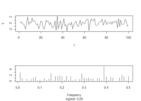
For a simulated white noise, none of the individual frequencies account for statistically significant variance (Fischer test - 0.29)
Problems in interpretation if the data is not detrended
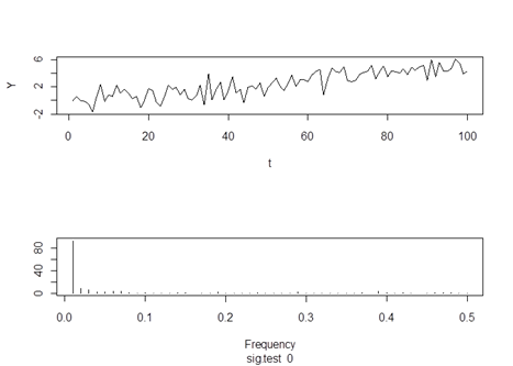
The periodogram shows a statistically significant a low frequency component. This example clearly shows the effect of not using detrended data for spectral analysis. A strong low frequency dominates everything.
Erroneous inclusion of baseline periods
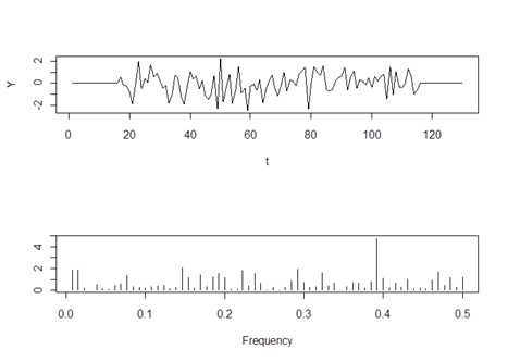
In this case, erroneous inclusion of baseline periods before and after the actual experimental data produces spurious peaks in the periodogram.
Sampling Issues
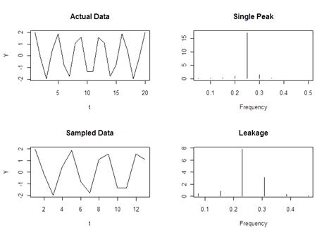
The above visuals show the effect of undersampling, i.e. the interval length is not an integer multiple of the underlying frequency. The top two graphs are for the data with the correct sampling whereas the bottom two graphs are the result of undersampling. Clearly the periodogram (bottom-right) shows more peaks than those present in the true data(top-right)
There is also an example of outliers spoiling the periodogram show. Overall, a very interesting chapter in the book. It warns the data analyst against misreading and misinterpreting the periodogram data.
The basic takeaway of the chapter is: It is easy to misinterpret periodogram output because of the presence of trend, outliers, boxcar waveforms, leakage etc. Out of all the culprits, aliasing is difficult to identify and work around. Typically one needs to over sample to be sure that the periodogram represents the correct output. Sampling frequency and time-series length become very crucial in estimating the true frequencies underlying the data.
Chapter 12: Theoretical Issues
The final chapter of the book deals with some of the issues that any data analyst would face in using methods described in the book, i.e.
-
Is the underlying process deterministic or stochastic in nature?
-
Is there a need to presume cyclicity in the data?
-
How to choose between doing a time domain analysis Vs frequency domain analysis?
 Takeaway :
The book gives the reader an intuitive understanding of Spectral analysis. One usually is exposed to time domain analysis in some form or the other. Looking at data in frequency domain is like having a new pair of eyes. Why not have them? The more eyes you have, the more “fox-like” skills (Hedgehog Vs. Fox) you develop in understanding data. With minimal math and equations, the book does a great job of motivating any reader to learn and apply spectral analysis tools and techniques.