Help a Colleague
Recently Viraj, a colleague of mine asked me to help him with some basic stats assignment..Spent 3 hours writing a document for him
Stats Assignment
Q1. List down and explain with examples the “data presentation methods” used in Statistics. Give example of two way (two variables) data presentation
A1) Not long ago, Data visualization was considered merely one of the steps in Data Analysis. Typically it was carried out at the end to present the results of model / analysis / data mining etc. Not anymore.
With the advent of computers, Data Visualization has become a pivotal component in all phases of statistical data analysis. It is being used in Data Cleaning, Data Preparation, Model Building, Model Back testing, Model Presentation. The word “Data Presentation” itself has morphed in to “Data Visualization”, thus witnessing a multitude of techniques. An immediate consequence is the rise of statistical packages, libraries dedicated to data presentation techniques. Howard Wainer, the author of a splendid book, “Picturing the Uncertain World”, writes about three commandments of data display
1. Remind us that the data being displayed do contain some uncertainty , and then
2. Characterize the size of that uncertainty as it pertains to the inferences we have in mind , and in so doing
3. Help keep us from drawing incorrect conclusions through the lack of a full appreciation of the precision of our knowledge.
Out of the multitude of data presentation techniques, I would try to give a sample of methods with examples.
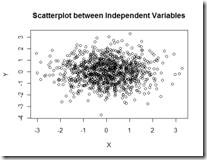
1. Scatterplot: This simple but powerful plot can be used to visualize basic relationships between two variables. Let’s say they are two random variables which are independent. A simple scatterplot would reveal the points all over the place instead of a linear / clustering phenomenon.
This simple plot can be effectively used to present your model residuals. If one has captured the correct statistical relationship , then the residuals / errors of the relationship should typically be white noise. A simple scatter plot of residuals can be an effective data presentation tool to validate your model development.
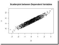
A plot between two variables can also help you decide the possible correlation between those variables.
2. Histogram : Given a set of data, the histogram plot gives a rough idea of the probability density function. The algorithm running behind any histogram is a simple binning rule which divides the data in to specific bins and reports the number of data points falling in the bin. Ofcourse, binning algorithms can randge from simple rule to pretty sophisticated algorithms. However the purpose of the histogram is straightforward. In one shot, it gives a great deal of visual insight in to the data such as skewness , kurtosis, uni-modal/bi-modal nature of data. Since it is a count based graph, one can get a fair idea about the mode of the data. An example to illustrate the use would be by constructing a histogram of returns for any financial security.
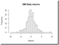 The Histogram plot of SBI Daily returns over the last 2 years show that it is far from normal , as it assumed in finance literature. One can overlay a normal or any kind of distribution to get a feel of the underlying distribution of the data.
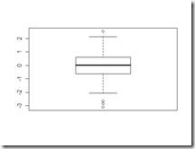
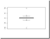
3. Box-Whisker Plot: Box plot is very appealing to me as it gives an idea of median , the 25th and 75th percentile of the data, as well as the outliers in the data. Boxplot marks these points and shows it in a plot. However the power of Boxplot comes to light when Boxplot is used to compare two or more random variables. To give an example, here is a box plot of 100 standard normal random variables(left) and the same data with two outliers -10 and 10 added (left)
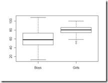
As one can see that boxplots are very effective to judge the outliers, the median ,25th , 75th percentile. Boxplots comparing two random variables are even more effective and might serve as a diagnostic tool for hypothesis tests such as t test / 1 way Anova etc. An example would be to check the test scores of boys and girls in a class.
The boxplot for the two groups reveals a lot. One is girls perform better than boys and more over the standard deviation of girls is less than boys. So, not only are girls score better than boys, but they consistently are better over boys. This is just a simulated example for two groups. The power of boxplot is fully appreciated when there are three dimensions to the data , where slicing the data for a specific combination of factors becomes the key to understanding and presenting data.
4. Contingency table: Well, one really does not see a plot here. But a cross tabulation of data across different categories plays an important in formulating hypothesis. Let’s say that there are two random variables X and Y and each of these has a subcategory X1, X2 and Y1, Y2. A basic cross tabulation of counts would reveal vital clues about the underling structure. It can also be a step before one goes in for a full-fledged 2 way anova or cross categorical analysis.
There are tons of other plots such as contour plot, density plot, stem-and-leaf plot etc that can be used for univariate and multivariate data display. However knowing the type of graph that needs to use for a context is an art that one needs to master.
**
Q2). What are Quartiles, Deciles and Percentiles?**
In any sample data, one needs to get an idea of the way the data is structured. Be it the returns of an financial asset, the test scores of students, the population of various cities, etc, there is a need to understand the data in one dimension. It goes by the name “Univariate” data analysis where the focus is one random variable.
By far the most basic statistics that one would want to look at are mean, median , mode. Beyond this, one would also be interested in knowing the data from a non-parametric angle, meaning, the statistics of a rank ordered data. Under this category, the first thing that a data analyst looks at are Quartiles, Deciles and Percentiles.
Quartiles:
The rationale behind this statistic is this: If I were to divide the data in 4 equal groups, what would be the three cut off points of the data?
For example, let’s consider the test scores of n students in a class. They may be all scattered from anywhere from 0 – 100.
If one orders the data in ascending order , tabulate the scores which cut off lowest 25% of the data, cuts off data in to half , cuts off the lowest 75% of the data, then these scores are called the 25th , 50th and the 75th percentile numbers. One can easily see these numbers using a boxplot. For example box plot for the above example might look like the following:
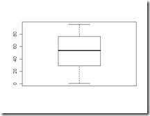 The ends of the box represent the 25th and 75th quartile. The line in the middle of the box represents the median.
The concept of Deciles is same as above but the data is split in to 10 groups and each of the 9 points that cuts off the data in to 10 groups. One obvious question would be ,”What is the purpose of deciles?”. These help you get a fine grained picture of the data. By looking at the 10% percentile and 90% percentile of the data, one can guage how far are the data points from the 50% percentile and whether the variation evident in the data is something that is expected out of data or not. Percentiles is an extension of the above idea where the groups are based on a customized percentile levels. It gives the analyst the flexibility to view the data point which cuts off a specific percentile of the population/ the value below which a certain percentage of the data lies.
Let’s say we have the following data of 40 numbers
72 , 88 , 76 , 89, 46 , 17 , 33, 51, 73, 99, 3 ,15 ,74 , 0 , 39 , 46, 39, 40, 18, 95, 45, 33, 97, 71, 64, 39, 70, 54, 23, 48, 79, 1, 19, 68, 37, 36, 87, 90, 62, 13
Quantiles would be
Percentile | Value |
25% | 33 |
50% | 47 |
75% | 73.25 |
Deciles would be
Percentile | Value |
10% | 14.8 |
20% | 22.2 |
30% | 36.7 |
40% | 39.6 |
50% | 47 |
60% | 62.8 |
70% | 71.3 |
80% | 76.6 |
90% | 89.1 |
With percentiles you can specify any percentile value that one is interested in.Let’s say I am interested in 45%, 65% and 83%
Percentiles would be
Percentile | Value |
45% | 45.55 |
65% | 68.7 |
83% | 81.96 |
Thus quantiles, deciles and percentiles are extremely useful in understanding the coarse grained and fine grained nature of the data.
Q3). Explain measures of Dispersion – Range, Inter Quartile Range and Mean Absolute Deviations.
Dispersion of the data captures the variability in the data. Variation as a concept was instrumental in the development of very many techniques for experimental testing. If one looks at the data , besides the summary statistic such as mean, median, inter quartile range, the one statistic which has captured the minds of scientists, engineers, quality control personnel, risk management professions( dispersion goes by the name volatility under risk management profession) . Variation came to the statistical center stage , thanks to the herculean efforts of Fischer. It was Fischer who changed the statistical landscape by introducing design of experiments , ANOVA( Analysis of variance ) , MANOVA( Multivariate Analysis of Variance) and a host of techniques whose underlying basis was variance. If one looks at various popular hypothesis testing procedures, they all revolve around variance.
Now that I have given a brief background to the concept of Dispersion, lets look at the ways to calculate the various measures of dispersion.
One obvious metric that comes to mind is Range of the data. This is basically the min and max of the data. Ideally one should get an idea the max variation of the data. This typically helps an analyst to investigate outliers. In most of the cases, the presence of high values and extremely low values can be attributed to incorrect data points or missing values. Thus range is an effective tool to capture these outliers. Once these outliers are removed, one can calculate the range on the sanitized data and this time, the range effectively captures the variation of the data.
The second metric for looking at dispersion is the Inter Quartile range which is nothing but the difference between 75th percentile and 25th percentile.
For example one can quickly see the two box plots below and get an idea of the variability/dispersion present in the data.
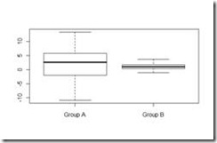 The boxplot for Group B is tighter than Group A and hence the dispersion of Group B is less than Group A. Even though this example presents a very clear cut case, most often this is not the case. There could be difference in the sample size between two populations, the group means could be different, the group data might be saddled with outliers, the group mights be realization of bimodal distributions. In all such cases, a simple box plot or inter quartile range is no good. However IQR acts as a starting point for further analysis.
MAD – Maximum absolute Deviation is a metric which gives the maximum of the Absolute deviation of all data points from the mean. One of the applications where this metric founds enormous application is Portfolio Analysis. Risk. as they say is in the eye of the beholder. There are a set of portfolio managers who perceive MAD as Risk and hence try to optimize their portfolio allocations accordingly.
Let’s look at an example for more clarity
72 , 88 , 76 , 89, 46 , 17 , 33, 51, 73, 99, 3 ,15 ,74 , 0 , 39 , 46, 39, 40, 18, 95, 45, 33, 97, 71, 64, 39, 70, 54, 23, 48, 79, 1, 19, 68, 37, 36, 87, 90, 62, 13
It takes the maximum of all the absolute values from each data point. In this case, it turns out to be 36.3237.
Thus all the above measures can be termed as diagnostic measures for a full fledged data analysis.
